Custom Visualization Widget
- Custom visualization provides the function to add custom code into OPNBI. by using this users can make required visualizations like charts, maps, tables, user interface for the dashboard, custom filters, etc.
Objective
- Make a Custom VIsualization Widget
Prerequisites
- Refer this link for different types of example.
Custom Visualization: This video contains how to create custom visualization in OPNBI.
Steps to create Custom Visualization Widget
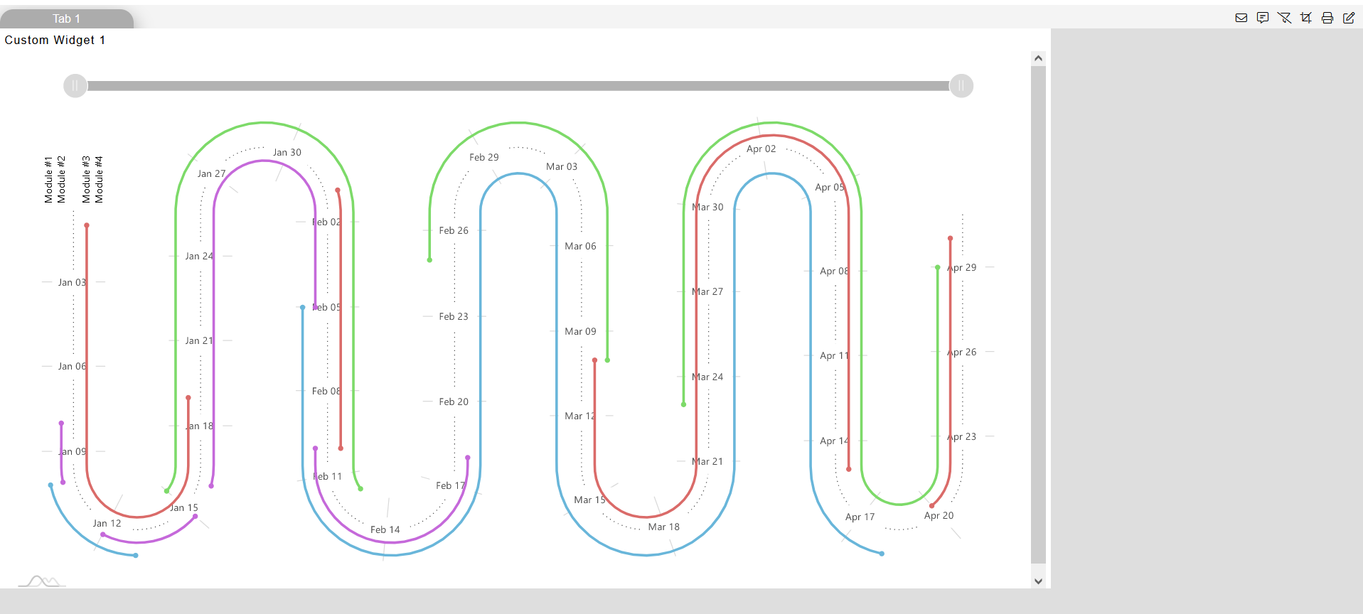
- Here, we have example to user required charts, you can click on each of the chart and access the code of chart widget.
Login to OPNBI using your credentials.
Go to Dashboard Section & create a new Dashboard using this link.
Select a Cusomtom Visualization Widget from the right vertical menu & widget gets added in the Dashboard content area.
Now paste the below given code (Any code from Example 1 or 2) into their respective tabs.
Example 1:
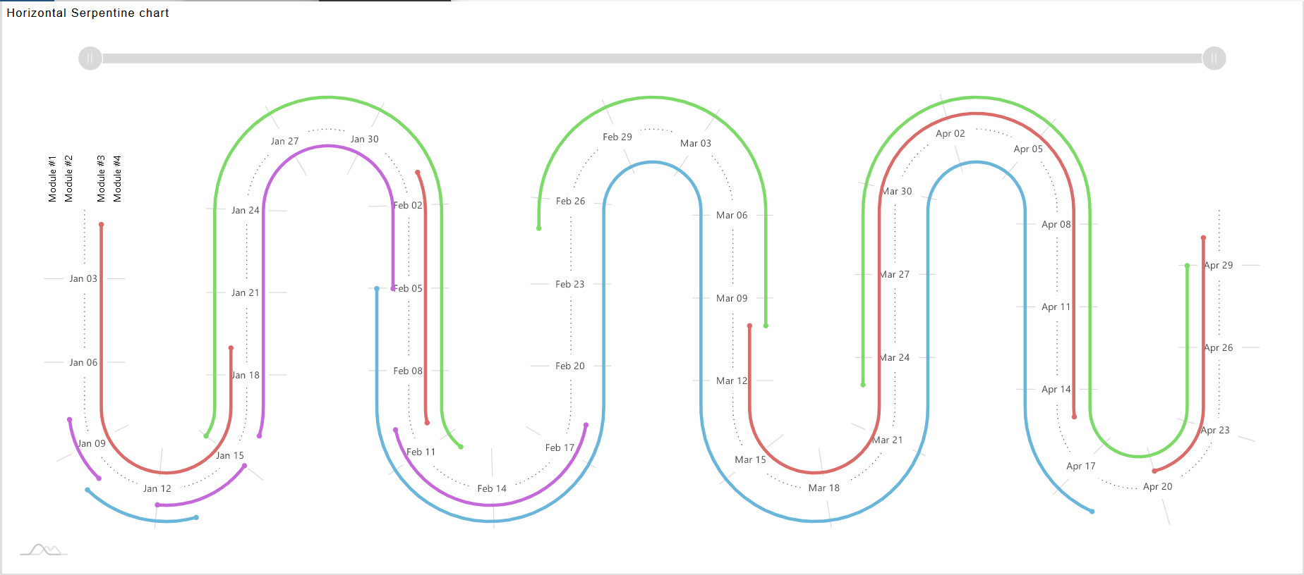
To create the above example put the code in relevant tabs:
- HTML
<script src="https://cdn.amcharts.com/lib/4/core.js"></script>
<script src="https://cdn.amcharts.com/lib/4/charts.js"></script>
<script src="https://cdn.amcharts.com/lib/4/plugins/timeline.js"></script>
<script src="https://cdn.amcharts.com/lib/4/plugins/bullets.js"></script>
<script src="https://cdn.amcharts.com/lib/4/themes/animated.js"></script>
<div id="chartdiv"></div>
- JavaScript
                            /**
 * ---------------------------------------
 * This demo was created using amCharts 4.
 *
 * For more information visit:
 * https://www.amcharts.com/
 *
 * Documentation is available at:
 * https://www.amcharts.com/docs/v4/
 * ---------------------------------------
 */

// Themes begin
am4core.useTheme(am4themes_animated);
// Themes end

var chart = am4core.create("chartdiv", am4plugins_timeline.SerpentineChart);
chart.curveContainer.padding(20,20,20,20);
chart.levelCount = 8;
chart.orientation = "horizontal";
chart.fontSize = 11;

var colorSet = new am4core.ColorSet();
colorSet.saturation = 0.6;

chart.data = [ {
  "category": "Module #1",
  "start": "2016-01-10",
  "end": "2016-01-13",
  "color": colorSet.getIndex(0),
  "task": "Gathering requirements"
}, {
  "category": "Module #1",
  "start": "2016-02-05",
  "end": "2016-04-18",
  "color": colorSet.getIndex(0),
  "task": "Development"
}, {
  "category": "Module #2",
  "start": "2016-01-08",
  "end": "2016-01-10",
  "color": colorSet.getIndex(5),
  "task": "Gathering requirements"
}, {
  "category": "Module #2",
  "start": "2016-01-12",
  "end": "2016-01-15",
  "color": colorSet.getIndex(5),
  "task": "Producing specifications"
}, {
  "category": "Module #2",
  "start": "2016-01-16",
  "end": "2016-02-05",
  "color": colorSet.getIndex(5),
  "task": "Development"
}, {
  "category": "Module #2",
  "start": "2016-02-10",
  "end": "2016-02-18",
  "color": colorSet.getIndex(5),
  "task": "Testing and QA"
}, {
  "category": "",
  "task": ""
},{
  "category": "Module #3",
  "start": "2016-01-01",
  "end": "2016-01-19",
  "color": colorSet.getIndex(9),
  "task": "Gathering requirements"
}, {
  "category": "Module #3",
  "start": "2016-02-01",
  "end": "2016-02-10",
  "color": colorSet.getIndex(9),
  "task": "Producing specifications"
}, {
  "category": "Module #3",
  "start": "2016-03-10",
  "end": "2016-04-15",
  "color": colorSet.getIndex(9),
  "task": "Development"
}, {
  "category": "Module #3",
  "start": "2016-04-20",
  "end": "2016-04-30",
  "color": colorSet.getIndex(9),
  "task": "Testing and QA"
}, {
  "category": "Module #4",
  "start": "2016-01-15",
  "end": "2016-02-12",
  "color": colorSet.getIndex(15),
  "task": "Gathering requirements"
},{
  "category": "Module #4",
  "start": "2016-02-25",
  "end": "2016-03-10",
  "color": colorSet.getIndex(15),
  "task": "Development"
}, {
  "category": "Module #4",
  "start": "2016-03-23",
  "end": "2016-04-29",
  "color": colorSet.getIndex(15),
  "task": "Testing and QA"
} ];

chart.dateFormatter.dateFormat = "yyyy-MM-dd";
chart.dateFormatter.inputDateFormat = "yyyy-MM-dd";

var categoryAxis = chart.yAxes.push(new am4charts.CategoryAxis());
categoryAxis.dataFields.category = "category";
categoryAxis.renderer.grid.template.disabled = true;
categoryAxis.renderer.labels.template.paddingRight = 25;
categoryAxis.renderer.minGridDistance = 10;
categoryAxis.renderer.innerRadius = -60;
categoryAxis.renderer.radius = 60;

var dateAxis = chart.xAxes.push(new am4charts.DateAxis());
dateAxis.renderer.minGridDistance = 70;
dateAxis.baseInterval = { count: 1, timeUnit: "day" };

dateAxis.renderer.tooltipLocation = 0;
dateAxis.startLocation = -0.5;
dateAxis.renderer.line.strokeDasharray = "1,4";
dateAxis.renderer.line.strokeOpacity = 0.7;
dateAxis.tooltip.background.fillOpacity = 0.2;
dateAxis.tooltip.background.cornerRadius = 5;
dateAxis.tooltip.label.fill = new am4core.InterfaceColorSet().getFor("alternativeBackground");
dateAxis.tooltip.label.paddingTop = 7;

var labelTemplate = dateAxis.renderer.labels.template;
labelTemplate.verticalCenter = "middle";
labelTemplate.fillOpacity = 0.7;
labelTemplate.background.fill =  new am4core.InterfaceColorSet().getFor("background");
labelTemplate.background.fillOpacity = 1;
labelTemplate.padding(7,7,7,7);

var categoryAxisLabelTemplate = categoryAxis.renderer.labels.template;
categoryAxisLabelTemplate.horizontalCenter = "left";
categoryAxisLabelTemplate.adapter.add("rotation", function (rotation, target) {
  var position = dateAxis.valueToPosition(dateAxis.min);
  return dateAxis.renderer.positionToAngle(position) + 90;
})

var series1 = chart.series.push(new am4plugins_timeline.CurveColumnSeries());
series1.columns.template.height = am4core.percent(20);
series1.columns.template.tooltipText = "{task}: [bold]{openDateX}[/] - [bold]{dateX}[/]";

series1.dataFields.openDateX = "start";
series1.dataFields.dateX = "end";
series1.dataFields.categoryY = "category";
series1.columns.template.propertyFields.fill = "color"; // get color from data
series1.columns.template.propertyFields.stroke = "color";
series1.columns.template.strokeOpacity = 0;

var bullet = new am4charts.CircleBullet();
series1.bullets.push(bullet);
bullet.circle.radius = 3;
bullet.circle.strokeOpacity = 0;
bullet.propertyFields.fill = "color";
bullet.locationX = 0;


var bullet2 = new am4charts.CircleBullet();
series1.bullets.push(bullet2);
bullet2.circle.radius = 3;
bullet2.circle.strokeOpacity = 0;
bullet2.propertyFields.fill = "color";
bullet2.locationX = 1;

chart.scrollbarX = new am4core.Scrollbar();
chart.scrollbarX.align = "center"
chart.scrollbarX.width = am4core.percent(90);

var cursor = new am4plugins_timeline.CurveCursor();
chart.cursor = cursor;
cursor.xAxis = dateAxis;
cursor.yAxis = categoryAxis;
cursor.lineY.disabled = true;
cursor.lineX.strokeDasharray = "1,4";
cursor.lineX.strokeOpacity = 1;

dateAxis.renderer.tooltipLocation2 = 0;
categoryAxis.cursorTooltipEnabled = false;
- CSS
body {
font-family: -apple-system, BlinkMacSystemFont, "Segoe UI", Roboto, Helvetica, Arial, sans-serif, "Apple Color Emoji", "Segoe UI Emoji", "Segoe UI Symbol";
}

#chartdiv {
width: 100%;
height: 600px;
}
.demo-theme-dark .demo-background {
background: #000;
}
Example 2:
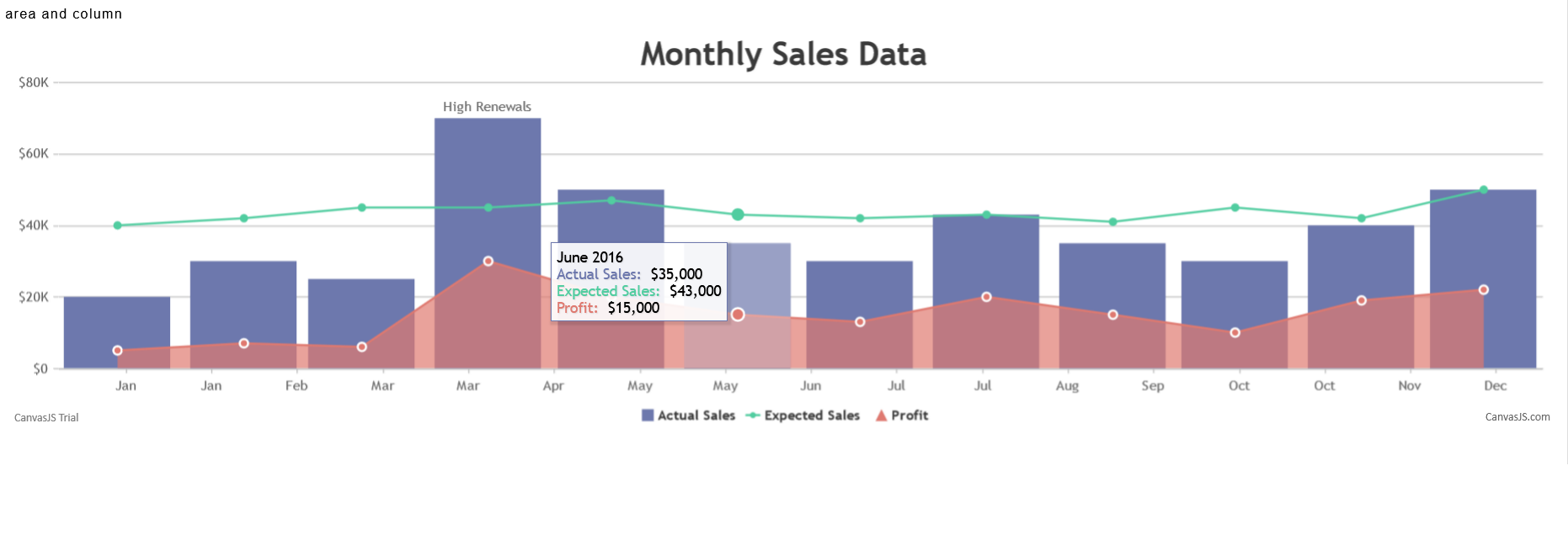
To create the above example put the code in relevant tabs:
- HTML
                            <!DOCTYPE HTML>
                            <html>
                            <head>
                            <script>

                            </script>
                            </head>
                            <body>
                            <div id="chartContainer" style="height: 370px; width: 100%;"></div>
                            <script src="https://canvasjs.com/assets/script/canvasjs.min.js"></script>
                            </body>
                            </html>
- JavaScript
                            window.onload = function () {

                                var chart = new CanvasJS.Chart("chartContainer", {
                                    animationEnabled: true,
                                    theme: "light2",
                                    title: {
                                        text: "Monthly Sales Data"
                                    },
                                    axisX: {
                                        valueFormatString: "MMM"
                                    },
                                    axisY: {
                                        prefix: "$",
                                        labelFormatter: addSymbols
                                    },
                                    toolTip: {
                                        shared: true
                                    },
                                    legend: {
                                        cursor: "pointer",
                                        itemclick: toggleDataSeries
                                    },
                                    data: [
                                    {
                                        type: "column",
                                        name: "Actual Sales",
                                        showInLegend: true,
                                        xValueFormatString: "MMMM YYYY",
                                        yValueFormatString: "$#,##0",
                                        dataPoints: [
                                            { x: new Date(2016, 0), y: 20000 },
                                            { x: new Date(2016, 1), y: 30000 },
                                            { x: new Date(2016, 2), y: 25000 },
                                            { x: new Date(2016, 3), y: 70000, indexLabel: "High Renewals" },
                                            { x: new Date(2016, 4), y: 50000 },
                                            { x: new Date(2016, 5), y: 35000 },
                                            { x: new Date(2016, 6), y: 30000 },
                                            { x: new Date(2016, 7), y: 43000 },
                                            { x: new Date(2016, 8), y: 35000 },
                                            { x: new Date(2016, 9), y:  30000},
                                            { x: new Date(2016, 10), y: 40000 },
                                            { x: new Date(2016, 11), y: 50000 }
                                        ]
                                    },
                                    {
                                        type: "line",
                                        name: "Expected Sales",
                                        showInLegend: true,
                                        yValueFormatString: "$#,##0",
                                        dataPoints: [
                                            { x: new Date(2016, 0), y: 40000 },
                                            { x: new Date(2016, 1), y: 42000 },
                                            { x: new Date(2016, 2), y: 45000 },
                                            { x: new Date(2016, 3), y: 45000 },
                                            { x: new Date(2016, 4), y: 47000 },
                                            { x: new Date(2016, 5), y: 43000 },
                                            { x: new Date(2016, 6), y: 42000 },
                                            { x: new Date(2016, 7), y: 43000 },
                                            { x: new Date(2016, 8), y: 41000 },
                                            { x: new Date(2016, 9), y: 45000 },
                                            { x: new Date(2016, 10), y: 42000 },
                                            { x: new Date(2016, 11), y: 50000 }
                                        ]
                                    },
                                    {
                                        type: "area",
                                        name: "Profit",
                                        markerBorderColor: "white",
                                        markerBorderThickness: 2,
                                        showInLegend: true,
                                        yValueFormatString: "$#,##0",
dataPoints: [
{ x: new Date(2016, 0), y: 5000 },
{ x: new Date(2016, 1), y: 7000 },
{ x: new Date(2016, 2), y: 6000 },
{ x: new Date(2016, 3), y: 30000 },
{ x: new Date(2016, 4), y: 20000 },
{ x: new Date(2016, 5), y: 15000 },
{ x: new Date(2016, 6), y: 13000 },
{ x: new Date(2016, 7), y: 20000 },
{ x: new Date(2016, 8), y: 15000 },
{ x: new Date(2016, 9), y:  10000},
{ x: new Date(2016, 10), y: 19000 },
{ x: new Date(2016, 11), y: 22000 }
]
}]
});
chart.render();

function addSymbols(e) {
var suffixes = ["", "K", "M", "B"];
var order = Math.max(Math.floor(Math.log(e.value) / Math.log(1000)), 0);

                                    if(order > suffixes.length - 1)
                                        order = suffixes.length - 1;

                                    var suffix = suffixes[order];
                                    return CanvasJS.formatNumber(e.value / Math.pow(1000, order)) + suffix;
                                }

                                function toggleDataSeries(e) {
                                    if (typeof (e.dataSeries.visible) === "undefined" || e.dataSeries.visible) {
                                        e.dataSeries.visible = false;
                                    } else {
                                        e.dataSeries.visible = true;
                                    }
                                    e.chart.render();
                                }

                                }
Click on Preview & Save and Exit button.
Now go to Preview mode of the dashboard by following this link.
Here user can see the output of their Dashboard as shown below: